
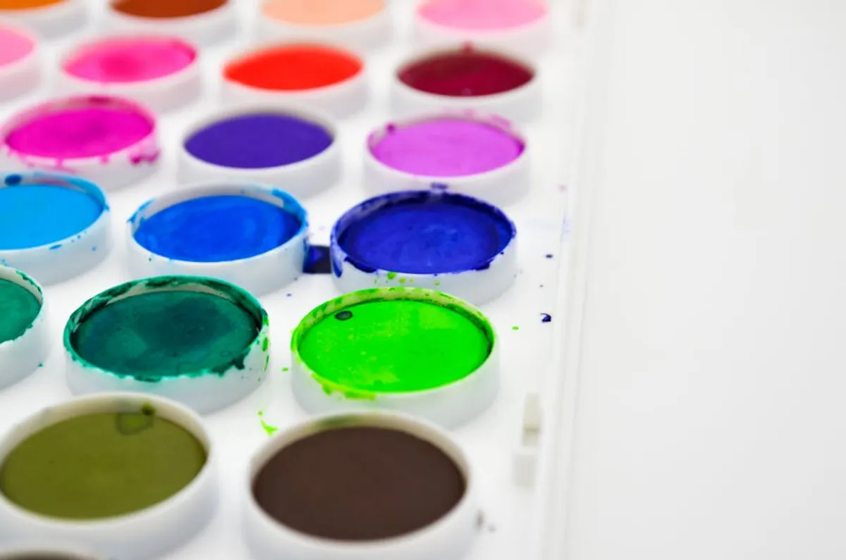
Selecting the right paint color represents one of the most impactful, yet often underestimated, decisions in a home update. A fresh coat of paint offers a cost-effective route to revitalize a space, influencing mood, perceived size, and overall aesthetic. The choice extends beyond personal preference, however; it involves understanding how light interacts with pigments, how colors harmonize with existing finishes, and the psychological effects different hues exert. A well-chosen palette can elevate a room, increase its perceived value, and create a cohesive flow throughout a property, while an ill-considered one can clash, diminish natural light, or quickly feel dated. This guide focuses on colors that consistently deliver a fresh, updated feel, offering both timeless appeal and contemporary relevance.
How to Choose Your Perfect Paint Color
Before committing to a specific shade, consider several critical factors that dictate a color's performance in your unique space. Natural and artificial lighting are paramount; a color can appear vastly different under warm incandescent bulbs versus cool LED or bright natural sunlight. Test swatches on multiple walls and observe them throughout the day. Evaluate your existing fixed elements: flooring, cabinetry, countertops, and upholstery. The paint color should complement, not compete with, these permanent fixtures. Room function also plays a role; a vibrant color might energize a playroom, while a soothing tone is more appropriate for a bedroom. Finally, define the mood you wish to create: a serene retreat, a lively social hub, or a sophisticated workspace. Each color carries inherent psychological associations that can support or detract from your desired atmosphere.
1. Classic White
Classic White, encompassing shades like Benjamin Moore's "Chantilly Lace" or Sherwin-Williams' "Pure White," remains a perennial choice for its unparalleled ability to brighten and expand spaces. This category offers a clean, crisp backdrop that allows architectural details, artwork, and furniture to stand out without visual competition. Its neutrality makes it highly adaptable to various design styles, from minimalist contemporary to rustic farmhouse. The key to successful application lies in understanding its undertones; some whites lean cool with blue or grey hints, while others are warmer with yellow or pink bases. Selecting the correct white prevents a stark or sterile appearance.
Best for: Maximizing natural light, creating a gallery-like backdrop, modern and minimalist aesthetics, small spaces, ceilings.
Pros:
- Enhances brightness and perceived space.
- Versatile and timeless, pairs with any accent color.
- Provides a clean, fresh foundation for decor.
- High resale value appeal due to broad acceptance.
Cons:
- Can appear stark or cold if undertones are not considered.
- Shows dirt and scuffs more readily than darker colors.
- Requires careful selection to avoid a "builder-grade" feel.
Verdict: A reliable choice for a fresh update, Classic White offers unmatched versatility and light reflection. Its success hinges on selecting a shade with appropriate undertones to avoid a clinical feel, making it a sophisticated canvas for diverse interiors.
2. Soft Greys
Soft Greys, exemplified by shades like Farrow & Ball's "Skimming Stone" or Sherwin-Williams' "Repose Gray," offer a sophisticated alternative to stark white or traditional beige. These muted tones provide a sense of calm and understated elegance, acting as a neutral foundation that feels more contemporary than older beige palettes. Soft greys vary significantly in their undertones, ranging from warmer greiges (grey-beige) to cooler blues and greens. This versatility allows them to complement both warm wood tones and cool metallic finishes, adapting to diverse decor schemes. They introduce depth without overwhelming a space, fostering a tranquil environment.
Best for: Creating a sophisticated, calming atmosphere, transitional and contemporary designs, living rooms, bedrooms, offices.
Pros:
- Modern and refined aesthetic.
- Excellent neutral base for various decor styles.
- Less prone to showing dirt than pure white.
- Adds depth without making a room feel small.
Cons:
- Cooler greys can feel cold in north-facing rooms.
- Requires careful consideration of undertones to avoid clashes.
- Some shades can appear flat without adequate lighting or contrasting elements.
Verdict: Soft Greys deliver a contemporary, elegant refresh, providing a versatile neutral that transcends trends. Their ability to adapt to different lighting and decor styles makes them a strong contender for a modern home update, provided undertones are carefully matched.
3. Warm Beiges
Warm Beiges, such as Benjamin Moore's "Bleeker Beige" or Sherwin-Williams' "Accessible Beige," represent a resurgence in popularity, moving beyond the dated yellow-based beiges of the past. Modern warm beiges incorporate subtle grey, taupe, or even green undertones, lending them a sophisticated earthiness. These colors create an inviting, cozy atmosphere, making a room feel grounded and comfortable. They pair exceptionally well with natural materials like wood, stone, and linen, enhancing a sense of organic warmth. Unlike cooler neutrals, warm beiges inherently feel welcoming and less formal, making them ideal for communal living spaces.
Best for: Creating cozy, inviting spaces, traditional and transitional interiors, complementing natural materials, living rooms, dining rooms, family rooms.
Pros:
- Instantly warms a room and creates a comfortable feel.
- Pairs well with a wide range of furniture and finishes.
- More forgiving than white for everyday wear and tear.
- Offers a timeless appeal that avoids fleeting trends.
Cons:
- Can appear bland or uninspired if not properly accented.
- Older, yellow-heavy beiges can look dated.
- Requires sufficient natural light to prevent a dull appearance.
Verdict: Warm Beiges offer a comforting and sophisticated update, moving beyond outdated iterations to provide a versatile, earthy neutral. They are excellent for establishing a welcoming ambiance, particularly when paired with natural textures and thoughtful lighting.
4. Muted Greens
Muted Greens, including shades like Benjamin Moore's "October Mist" or Farrow & Ball's "Clare Green," bring the tranquility of nature indoors without overwhelming the space. These greens are desaturated, often with grey or brown undertones, making them feel organic and sophisticated rather than vibrant or childish. They evoke a sense of calm and well-being, ideal for spaces intended for relaxation or focus. Muted greens work well with both warm and cool palettes, complementing natural wood, crisp whites, and even soft pinks or blues. Their earthy quality helps to ground a room and provide a subtle connection to the outdoors.
Best for: Bedrooms, home offices, bathrooms, creating a serene and natural aesthetic, biophilic design.
Pros:
- Promotes a sense of calm and relaxation.
- Adds a sophisticated touch of color without being overpowering.
- Pairs well with natural materials and diverse color schemes.
- Offers a unique, yet timeless, alternative to traditional neutrals.
Cons:
- Can appear dull in rooms with insufficient natural light.
- Requires careful selection to avoid shades that lean too yellow or grey.
- May not appeal to those who prefer strictly neutral palettes.
Verdict: Muted Greens offer a refreshing and grounding update, infusing spaces with natural tranquility and sophisticated color. They are particularly effective for creating peaceful retreats, provided lighting conditions are favorable to highlight their subtle depth.
5. Dusty Blues
Dusty Blues, like Sherwin-Williams' "Misty" or Farrow & Ball's "Light Blue," are characterized by their desaturated, often greyed-out quality, moving away from bright or primary blues. These shades offer a serene and sophisticated feel, reminiscent of a clear, hazy sky. Dusty blues are known for their calming properties, making them excellent choices for bedrooms, bathrooms, or any space where relaxation is desired. They pair beautifully with crisp whites, warm woods, and metallic accents, creating a balanced and airy environment. Their muted nature prevents them from feeling overwhelming, allowing them to act as a soft color neutral.
Best for: Bedrooms, bathrooms, nurseries, coastal-inspired designs, creating a tranquil and airy ambiance.
Pros:
- Promotes a sense of calm and serenity.
- Adds a subtle pop of color without being too bold.
- Works well with both warm and cool decor elements.
- Timeless appeal that feels fresh and inviting.
Cons:
- Can appear cool in rooms with limited natural light.
- Requires careful consideration of undertones to avoid a baby blue or overly grey look.
- May not suit interiors aiming for a strictly warm or earthy palette.
Verdict: Dusty Blues provide a refreshing and tranquil update, offering a sophisticated take on blue that is both calming and versatile. Their muted quality ensures they integrate seamlessly into various design schemes, creating an airy and peaceful atmosphere.
6. Deep Navies
Deep Navies, such as Benjamin Moore's "Hale Navy" or Sherwin-Williams' "Naval," offer a dramatic yet classic option for a home update. These rich, saturated blues provide a sense of gravitas and sophistication, often acting as a striking accent wall or a bold statement in a smaller room. Unlike lighter blues, navy can make a space feel more intimate and enveloping, particularly in rooms with ample natural light or high ceilings. It pairs exceptionally well with crisp whites, brass accents, dark wood, and even vibrant pops of color like coral or emerald, creating a luxurious and tailored aesthetic.
Best for: Accent walls, dining rooms, home offices, powder rooms, creating a sophisticated and dramatic statement, traditional and nautical themes.
Pros:
- Creates a sense of depth and luxury.
- Highly versatile, pairing well with many colors and materials.
- Hides imperfections and scuffs better than lighter colors.
- Timeless and elegant, offering a bold yet classic appeal.
Cons:
- Can make a small room feel smaller if used on all walls without sufficient light.
- Requires careful planning with lighting to avoid a cave-like effect.
- May be too intense for those preferring lighter, airier spaces.
Verdict: Deep Navies deliver a powerful, sophisticated update, adding drama and depth to any space. While best used strategically, their classic elegance and versatility make them an excellent choice for a bold yet refined transformation.
7. Terracotta Tones
Terracotta Tones, ranging from muted clay to richer burnt oranges, offer a warm, earthy, and organic feel that has seen a significant resurgence. Shades like Farrow & Ball's "Red Earth" or Sherwin-Williams' "Cavern Clay" bring a sense of rustic charm and global influence into a space. These colors are inherently warm and inviting, promoting comfort and a connection to natural elements. They pair beautifully with natural textures such as wood, rattan, and linen, as well as with deep greens, creams, and even soft blues. Terracotta tones add a unique character and warmth that can instantly update a room with a bohemian or Mediterranean flair.
Best for: Living rooms, dining rooms, kitchens, accent walls, creating a warm, earthy, or bohemian aesthetic, complementing natural materials.
Pros:
- Introduces significant warmth and character.
- Connects spaces to nature and global design influences.
- Pairs well with a wide array of natural textures and colors.
- Offers a distinct, on-trend yet timeless appeal.
Cons:
- Can be overpowering if not balanced with neutral elements.
- Requires careful selection to avoid looking dated or too specific.
- May not suit minimalist or strictly cool-toned interiors.
Verdict: Terracotta Tones provide a vibrant, earthy update, infusing rooms with warmth, character, and a connection to natural design. They are an excellent choice for those seeking to add a distinctive, inviting, and globally-inspired touch to their home.
8. Greige
Greige, a sophisticated blend of grey and beige, offers the best of both worlds: the warmth of beige with the cool modernity of grey. Shades like Benjamin Moore's "Revere Pewter" or Sherwin-Williams' "Agreeable Gray" are highly versatile, adapting their appearance based on lighting and surrounding colors. This chameleon-like quality makes greige an ideal neutral for open-concept homes, as it can seamlessly transition between different rooms and decor styles. It provides a soft, understated backdrop that is neither too warm nor too cool, allowing furniture and artwork to take center stage while maintaining a contemporary feel.
Best for: Open-concept living spaces, transitional homes, creating a balanced neutral foundation, living rooms, bedrooms, hallways.
Pros:
- Extremely versatile, complements both warm and cool palettes.
- Offers a sophisticated, contemporary neutral alternative.
- Less likely to appear cold than pure grey or yellow than pure beige.
- Excellent choice for resale value due to broad appeal.
Cons:
- Can appear bland if not paired with contrasting textures or colors.
- Its chameleon nature means it can look different than expected in varying lights.
- Requires testing to ensure the specific undertones work with existing elements.
Verdict: Greige stands out as a highly adaptable and universally appealing neutral for a fresh home update. Its ability to bridge warm and cool tones makes it an excellent choice for creating a cohesive, contemporary backdrop that supports diverse design aesthetics.
9. Charcoal
Charcoal, encompassing deep, rich grey tones like Farrow & Ball's "Down Pipe" or Benjamin Moore's "Kendall Charcoal," offers a dramatic and sophisticated alternative to black. This deep neutral provides a powerful backdrop that can make a room feel both intimate and expansive, particularly when paired with lighter trim and ceiling colors. Charcoal works exceptionally well in contemporary, industrial, or even traditional settings, adding a touch of refined elegance. It highlights artwork, metallic finishes, and vibrant textiles, creating a striking contrast. Its depth can also make a space feel more grounded and secure.
Best for: Accent walls, dramatic dining rooms, sophisticated home offices, powder rooms, creating a contemporary or industrial aesthetic, highlighting art.
Pros:
- Creates a dramatic, high-impact statement.
- Adds sophistication and a sense of luxury.
- Excellent for contrasting with lighter elements and vibrant colors.
- Hides imperfections and wear effectively.
Cons:
- Can make small rooms feel smaller if not balanced with light.
- Requires ample natural or artificial lighting to prevent a gloomy feel.
- May be too bold for those preferring a light and airy aesthetic.
Verdict: Charcoal delivers a bold and sophisticated update, offering a contemporary edge and dramatic depth. While best used strategically, its ability to create a luxurious and intimate atmosphere makes it an impactful choice for a modern home transformation.
10. Light Pinks
Light Pinks, ranging from blush to muted rose, like Benjamin Moore's "First Light" or Farrow & Ball's "Setting Plaster," offer a soft, inviting, and surprisingly versatile option for a fresh home update. Moving beyond overtly feminine associations, modern light pinks are often desaturated with grey or beige undertones, making them feel sophisticated and calming rather than saccharine. They introduce a subtle warmth and glow, creating a gentle, uplifting atmosphere. Light pinks pair beautifully with warm woods, brass accents, crisp whites, and even deep greens or navies, adding a touch of unexpected elegance and softness.
Best for: Bedrooms, nurseries, bathrooms, living rooms, creating a soft, warm, and inviting ambiance, contemporary and eclectic styles.
Pros:
- Introduces warmth and a gentle, uplifting mood.
- Offers a unique yet sophisticated color choice.
- Pairs well with both neutrals and bolder accent colors.
- Creates a soft, flattering light in a room.
Cons:
- Can appear overly sweet or childish if the wrong shade is chosen.
- Requires careful selection of undertones to avoid a bubblegum effect.
- May not appeal to all occupants or design preferences.
Verdict: Light Pinks provide a fresh, soft, and unexpectedly sophisticated update, infusing spaces with warmth and a gentle, inviting glow. When chosen with subtle, desaturated undertones, they offer a modern and versatile alternative to traditional neutrals.
11. Sage Green
Sage Green, a soft, muted green with grey undertones, is a highly popular choice for its calming and sophisticated appeal. Shades such as Sherwin-Williams' "Clary Sage" or Benjamin Moore's "Saybrook Sage" evoke a sense of natural tranquility and understated elegance. This color is incredibly versatile, acting as a neutral that brings the outdoors in, promoting relaxation and focus. Sage green pairs beautifully with warm woods, crisp whites, creams, and even earthy terracotta tones, creating a harmonious and organic palette. Its desaturated quality prevents it from feeling overwhelming, making it suitable for a variety of rooms.
Best for: Bedrooms, bathrooms, kitchens, home offices, creating a serene and organic atmosphere, farmhouse, Scandinavian, or natural modern aesthetics.
Pros:
- Promotes calm, balance, and a connection to nature.
- Acts as a versatile neutral, complementing many styles.
- Offers a subtle, sophisticated color without being too bold.
- Timeless and enduring appeal.
Cons:
- Can appear dull in very low-light conditions.
- Requires testing to ensure the grey or green undertones are desired.
- May not provide enough vibrancy for those seeking a bolder statement.
Verdict: Sage Green offers a consistently fresh and tranquil update, providing a sophisticated earthy neutral that calms and grounds a space. Its versatility and timeless appeal make it an excellent choice for creating a serene and naturally inspired interior.
12. Creamy Off-Whites
Creamy Off-Whites, including shades like Benjamin Moore's "White Dove" or Farrow & Ball's "Wimborne White," offer a softer, warmer alternative to stark pure white. These colors carry subtle yellow, beige, or even pink undertones, which prevent them from feeling cold or sterile. They provide a gentle luminosity that brightens a room while imparting a cozy, inviting feel. Creamy off-whites are exceptionally versatile, working well with both traditional and contemporary decor, and they serve as an excellent backdrop for artwork and darker furniture. Their inherent warmth makes them particularly suitable for north-facing rooms that receive cooler light.
Best for: Entire home palettes, living rooms, bedrooms, kitchens, creating a warm and inviting atmosphere, traditional, transitional, and farmhouse styles.
Pros:
- Softens and warms a room more than pure white.
- Highly versatile, pairs with a broad range of colors and materials.
- Creates a bright yet cozy and inviting ambiance.
- Excellent for maintaining a light, airy feel without starkness.
Cons:
- Can appear yellow or dingy if the undertones clash with existing elements.
- Still prone to showing dirt and scuffs, though less than pure white.
- Requires careful sampling to ensure the desired warmth is achieved.
Verdict: Creamy Off-Whites offer a warm, sophisticated update, providing a luminous and inviting alternative to pure white. Their subtle undertones create a cozy backdrop that enhances natural light and complements a wide array of design aesthetics.
Selecting the Right Shade for Your Space
Choosing the ideal paint color extends beyond general categories to selecting the precise shade that performs best in your home. Always obtain physical paint samples and apply them to several areas of your walls. Observe these swatches at different times of day and under various lighting conditions—natural daylight, evening lamps, and overhead fixtures. Pay close attention to how the color interacts with your existing flooring, trim, and large furniture pieces. Consider the undertones; a seemingly neutral grey might reveal blue, green, or purple hints, which can either harmonize or clash with your decor. Don't rush the decision; live with the samples for a few days to ensure the color enhances the room's mood and functionality as intended. A well-considered choice will result in a cohesive, updated space that feels both fresh and uniquely yours.
Frequently Asked Questions About Paint Colors
Q: How do I account for different lighting conditions?
A: Lighting significantly alters how a color appears. Natural light from north-facing windows is cooler and can make colors appear more subdued, while south-facing light is warmer and brighter. East-facing rooms get bright morning light, and west-facing rooms get warm afternoon light. Always test paint swatches on walls that receive different light exposures throughout the day. Artificial light also matters: incandescent bulbs cast a warm, yellow glow, while LEDs can range from cool white to warm white. Select a color that looks good in all typical lighting scenarios for that room.
Q: What are undertones and why are they important?
A: Undertones are the subtle colors beneath the dominant hue, often appearing as hints of red, blue, green, or yellow. For example, a grey paint might have a blue undertone, making it feel cooler, or a beige undertone, making it feel warmer. They are crucial because they can clash with existing elements like flooring, cabinetry, or furniture. A grey with a green undertone might look unappealing next to a red-toned wood floor. Identifying undertones by comparing samples against a pure primary color or a true neutral helps ensure harmony.
Q: Should I paint a small room a light or dark color?
A: This depends on the desired effect. Light colors generally make a small room feel larger and more open by reflecting light. However, a deep, saturated color like navy or charcoal can create a dramatic, cozy, and intimate "jewel box" effect in a small space, especially when paired with ample lighting and lighter accents. The key is to commit to the chosen mood rather than trying to achieve both expansiveness and coziness simultaneously. For a fresh update, lighter colors are often preferred for their brightening effect.
Q: How does paint finish affect the color?
A: The paint finish (sheen) significantly impacts how a color looks and performs. Matte or flat finishes absorb light, making colors appear richer and deeper, and are excellent for hiding wall imperfections. However, they are less durable and harder to clean. Eggshell and satin finishes have a slight sheen, offering more durability and easier cleaning, and reflect a bit more light, making colors appear slightly brighter. Semi-gloss and high-gloss finishes are highly reflective, making colors appear very vibrant and are best for trim, doors, and high-traffic areas due to their extreme durability and washability.